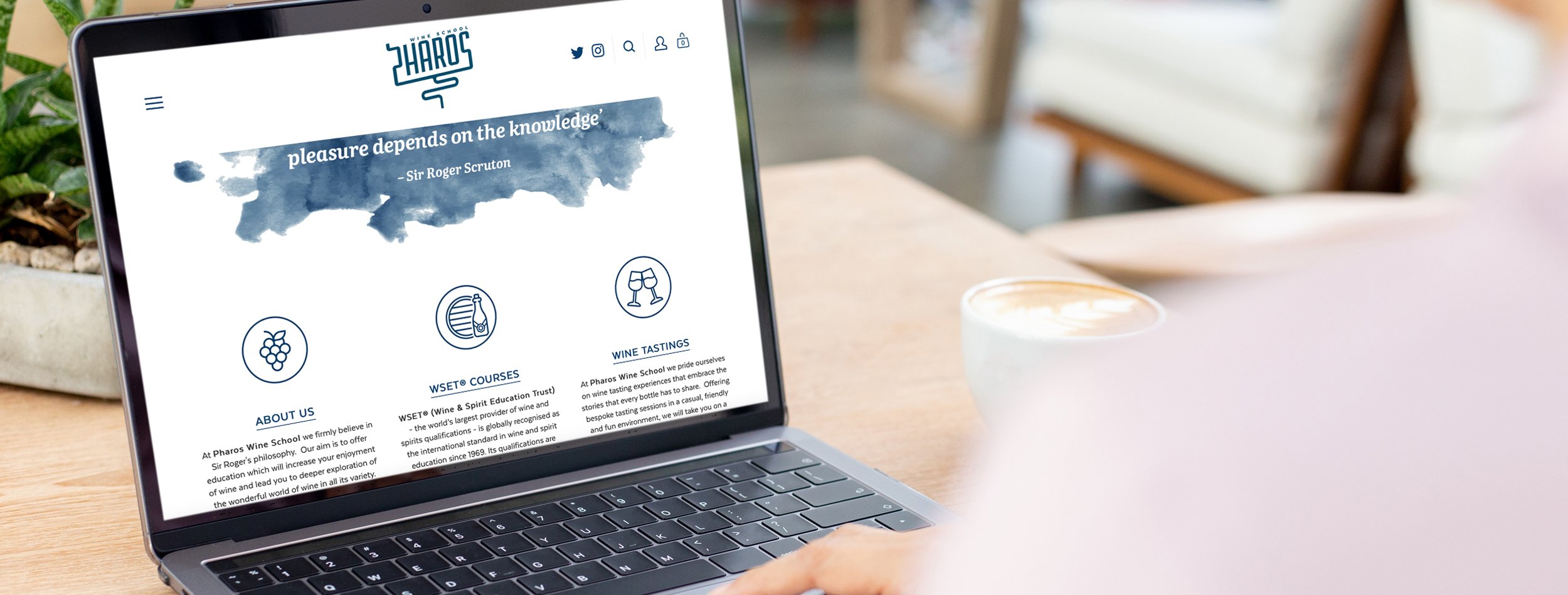
Pharos Wine School
Commissioned by the founder of Pharos Wine School, to design their logo, stationery, pop-up stands, wine matts, leaflets, coasters and website.
The trick was to combine pharos, meaning lighthouse or beacon and the wine school into a branding that merged both objects together. By pealing away both lighthouse and wine school to their core element and combining both these key elements - the lightbulb filament and the corkscrew - to create a logo which tied them both together in an abstract and simple way.


